Friday 15 October 2010

Background Colours.

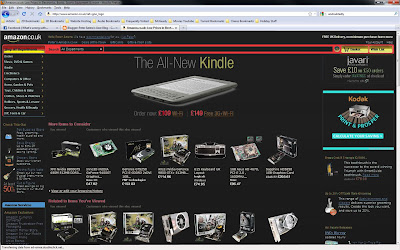
One thing you will notice is that alot of standard websites have a colour scheme. For now, im going to talk about background colours.

Amazon has a Blue, Orange and White colour scheme.
Play.com Has a red and White scheme (for now). You'll find product website place their products on white 90% of the time. Why? The answer is simple, it's because it's easier for us to quickly snap up a product visually. A product which is being advertised will be an array of colours. So to draw our eye to this product you need a colour which wont interfere as a background. With 1000's of products being every colour, white is undoubtedly the best choice as a background. It's such a simple concept, but so rarely identified. Not only that, because users identify places like Amazon, Play, etc on white, when something else comes up, it looks unnatural, unfamiliar, and can look unproffessional. Causing less sales, less clients, failure on the website, and failure on your part. Meaning you probably won't get a recommendation from your client.

BBC uses an array of colours, but with a different colour scheme per pag
e. However its the layout that keeps the consistency between the website. The Menu is always at the top, and although changes colour, never changes shape or design, making it familiar to users when they browse. But notice this, to keep all the pages familiar, the BBC always show their important information on white, making it easily spotted, and identifiable. Like a product webside.

It's up to you, the creator to decide what colour scheme is best for your website. I've noticed alot of great websites use bold colours if they are a marketing website, such as play and ebay, however ive also came to notice that more artistic websites which are information based bring in their target audience by making the interface user friendly via a defined easy on the eye colour scheme.

What I propose to you, is that you do the same. Create and decide on your colour scheme before you start your website. Pick 3 or 4 colours and base it around that. Dont get me wrong, other colours are welcome, but throughout your website the colour scheme should be apparent and easy on the eye. Test visual in fireworks or photoshop first. It takes seconds to place a bunch of boxes together, where as it takes ages to realign and rework a website which has to be redone visually because the colour scheme is a complete mess.

Here's a thought...would Say...amazon be just as successful as they are now, if they had a red, yellow on black colour scheme?
Sunday 10 October 2010

Header Images.

As we all know, colours and images can make or break a website or image. Picking the right image can give a target audience a professional welcome, whereas choosing the wrong image can be disastrous and will ensure a user of even client will never look back at your website.

From a Designers perspective it is imperative to know what the website brief is. A website which is showcasing a portfolio should have a visual edge to it, where as something which is designed for say online shopping should be as sleek and simple as it comes. Undeniably simplicity is a key which is why we reinforce it all the time, but you can also use complexities to draw an eye to anything straight away. Let’s not stray though...

Colour, is one of the awesome keys to unlocking the professional looking door. Let’s take the concept of Scottish Highlands. So your client asks you to create a website for them. He or she gives you this image, which is to be the top main image.

Just a quick note...these images have been badly compressed by the uploader, so quality has dropped quite a bit, even when you click to see it in full size.

Expect something like this to be the norm’. Where you are given something poor, and you are expected to make it look product worthy. This is where Fireworks and Photoshop come into it. Get to know these programs as much as you can, because they will make your life much easier.

If its the banner image, then it's going to be best to crop this into a landscape image, the last thing you would want is a banner image the same size as your entire page. Taking this into Photoshop, I use the crop tool. And pick a central area of focus.

I adjust both the Levels and Vibrance of the image. Make it bolder and display a better contrast.

Now we are getting somewhere. Although the image isa little too bold and overbearing we can choose to pull it back to suit our needs. I still feel at this point in time the greens are too green. Sounds ridiculous, but its true. What I mean is that they would benefit from incorporating a leaning over towards its neighbouring colours, like blue and yellow. I think yellow would give it a too earthy look, so for warmth and attractiveness I want to take the greens and make them have an element of green in them. You can do this by Going to Image > Adbjustments > Hue and saturation.

When in this box, under Master you can see that you can change things like only the blues, and Only the greens etc. Thats fine But the yellow/green colour I was to change isnt in that list. The good thing is that in Photoshop, while I have my hue/saturation tool open I can individually click a colour I want to change by clicking on the area I want to change. You will notice that when doing so, you will have a droper tool.

I should point out that the screen shot has MASTER as its selection, when I select greens and used the droper tool, it changes to Yellow2.This means when I adjust the HUE Im changing THAT type of green/yellow Ive selected without adjust anything else.

I also did the same for the Sky. Not only that for the sky, its was so cloudy, I took a wacom tablet, and pushed in some whites to make it less cloudy.

The one problem is that this image is slightly blurred. And its not sharp. So I decided to duplicate the layer, put a sharpen filter on it, then reduce the opacity on the shapened layer. This means that the sharpen filter wont go over kill, and I can manually adjust to my pleasing. Constantly clicking the eye tool on and off to check the difference. I usually go about pulling out the lights to the darks with the Dodge and Burn Tool. But ever so slightly as it can produce nice contrasts.

Say..then your client was to ask you to create the website though with a purple blue theme. To give it all a cool look. Well you can change your Hue/Saturation to Colourize. So I created a duplicate layer, and gave it a colour of purple.

Then dropped the opacity of that image, to 40% and let the original colours come through. After that I just change my Levels a bit to bring back some light. And added an overlay image with Tartan and added some text.

So there we go. A quick example of how an average image can be manipulated to be used as a banner for a website without going over the top in colour.


IMPORTANT TIP!

Oh and a quick tip! When using images, get as big as resolution as you can. Sizing an image down makes a nice blend of sharp pixels, but sizing a small image up gives you a horrible blurred image. So never take a small image, and size up. If the image you have isnt big enough. Then dont use it!

Friday 13 February 2009

Welcome to my blog.

This blog was created so I can communicate with other bloggers at ease.